Screen Resolution vs. Window Size: Understanding the Size Parameters in Your Fingerprint with MostMate
The short version: screen resolution describes the pixel size of the display, window size describes how much of it the browser currently shows, and websites can read both; the values feed into the fingerprint, yet no single one of them proves anything on its own. What matters more than chasing a flattering number is a set of parameters that agree with each other and stay stable over time. The article moves from separating the two concepts to how the values are read, how they relate to fingerprinting, common misconceptions, how to check them, and how to configure them in MostMate.
On a detection site, Screen Resolution reads 1920×1080 while the window size on the next line says 1536×750, and the two numbers refuse to match. Anyone reading a fingerprint report closely for the first time has probably stalled right here. Some blame the test page; others start to worry about their environment. The truth is that these two numbers were never the same thing in the first place, so a mismatch is the normal state, not a defect. What is worth watching instead is whether the size parameters fit together sensibly.
MostMate is an anti-detect browser whose official site pitches it as a beginner-friendly AI anti-detect browser. Each account gets its own isolated browser environment, and the screen-related values are among the basic items of that setup. This article first separates the two concepts, then gets concrete about setting and verifying them inside the product.
Screen Resolution vs. Window Size: Not Just a Different Number
Screen resolution is the pixel size of the display device; window size is the visible area the browser window currently occupies. The two describe different objects.
The screen resolution is settled by the monitor's hardware. Familiar values such as 1920×1080 and 2560×1440 state how many pixels the whole panel contains, and once the operating system is installed they hardly ever change. System scaling alters only how content is presented; the physical pixels stay on the same panel.
Window size is another matter entirely. A browser window can fill the screen or huddle in one corner. Maximized, it approaches full screen, but the tab strip, the address bar and the system taskbar all get deducted, which is why the window size usually falls short of the screen resolution.
It is also the more restless of the two. Drag an edge, split the screen, carry the window over to a second monitor, and the reading follows; the same machine can report different values from one day to the next.
Let's put the two side by side:
| Aspect | Screen resolution | Window size |
|---|---|---|
| What it describes | The display device itself | The current browser window |
| How often it changes | Practically fixed | Shifts with every window action |
| What shapes it | Hardware and system scaling | Window state and browser UI |
| Can websites read it | Yes | Yes |
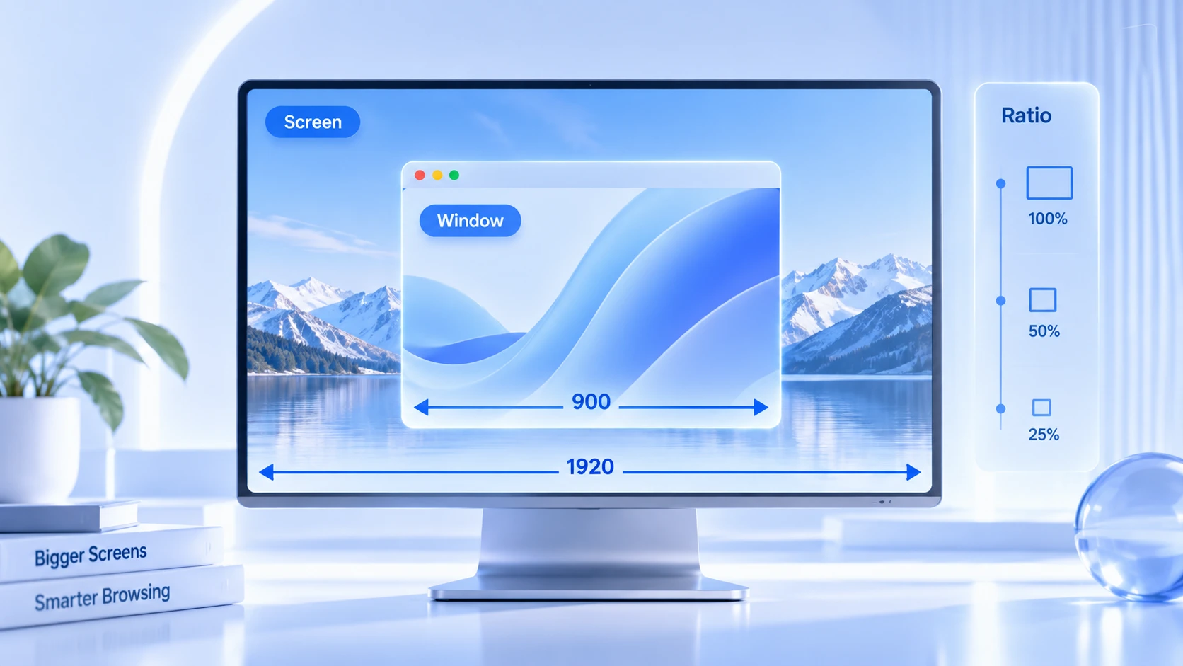
What Size Parameters a Website Can Read
The browser organizes screen and window information into a few groups of parameters and hands them to page scripts, one call away. MDN's documentation for the screen API carries the full definitions of these properties. For day-to-day checks, four groups matter most.
- screen.width / screen.height: the dimensions of the entire screen, sourced from the monitor and the system settings. Page scripts can read them at any time, no permission needed.
- window.innerWidth / window.innerHeight: the width and height of the visible page area, in other words the everyday window size. The window moves, and these move with it.
- window.devicePixelRatio: the ratio of CSS pixels to physical pixels. High-density screens and system scaling push it to 1.25, 1.5 or 2, and one resolution with two scaling settings yields two different readings.
- screen.availWidth / screen.availHeight: the area left after the system taskbar is subtracted. Usually a few dozen pixels short of the full resolution, and which direction the shortfall runs in depends on where the taskbar sits.
On their own, these groups look unremarkable. Only in combination do they amount to a signature. Window values trail your actions while screen values hold their ground, and it is precisely this contrast, which values moved and which did not, that lets a website split the story into a device layer and a session layer.
Why Size Parameters Become Part of the Fingerprint
A fingerprint is rarely decided by a single parameter. What a website examines is whether a bundle of values adds up to one real, stable device.
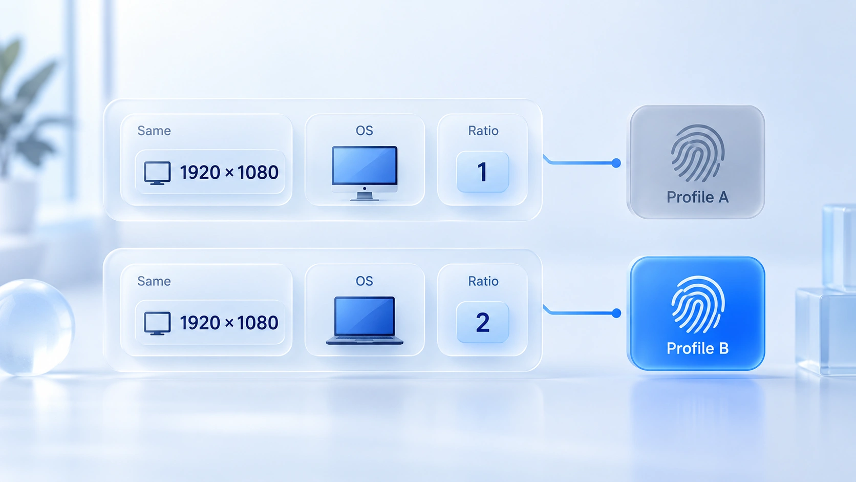
A lone 1920×1080 says very little. Tens of millions of devices run at that resolution. Set it next to the operating system, the User-Agent, devicePixelRatio, the font list and the GPU details, and the combination becomes far more telling.
1920×1080 alongside Windows and desktop Chrome is among the most common pairings in existence. A tiny screen carrying a desktop operating system's user agent, however, is a contradiction that defies common sense. The official site has used exactly this example: a phone-sized 390×844 screen on a desktop operating system marks the environment as assembled at a glance. As for the full inventory of what makes up a browser fingerprint, the what-is-browser-fingerprint article keeps the complete list; size parameters are just one group in it.
Window size plays a different part. Screen parameters are stable, window parameters are dynamic. A website will not rebuild its picture of you over one window resize, but it does check whether the window size sits in a plausible range. A visible page area wider than the entire screen, for example, is a reading that cannot be squared.
So within a fingerprint, size parameters behave like one row of readings on a medical checkup sheet. A single row yields no verdict. Only when the whole sheet is compared do anomalies surface.
Same Screen Resolution, Same Fingerprint?
Not necessarily. Two users on 1920×1080 can still differ in operating system, browser version, devicePixelRatio, time zone, fonts, and in what their GPU and Canvas render. Any one of those differences pulls the overall fingerprints apart. An identical resolution does not entail an identical fingerprint.
The reverse claim collapses just as quickly. Different window sizes do not point to different devices; the same person maximizes the window today and splits the screen tomorrow, and the window parameters move with them. Size parameters are fit for auditing the state of an environment, not for standing in as proof of identity.
How to Check the Size Parameters of Your Current Environment
The theory takes a minute, the check takes two. Follow this order:
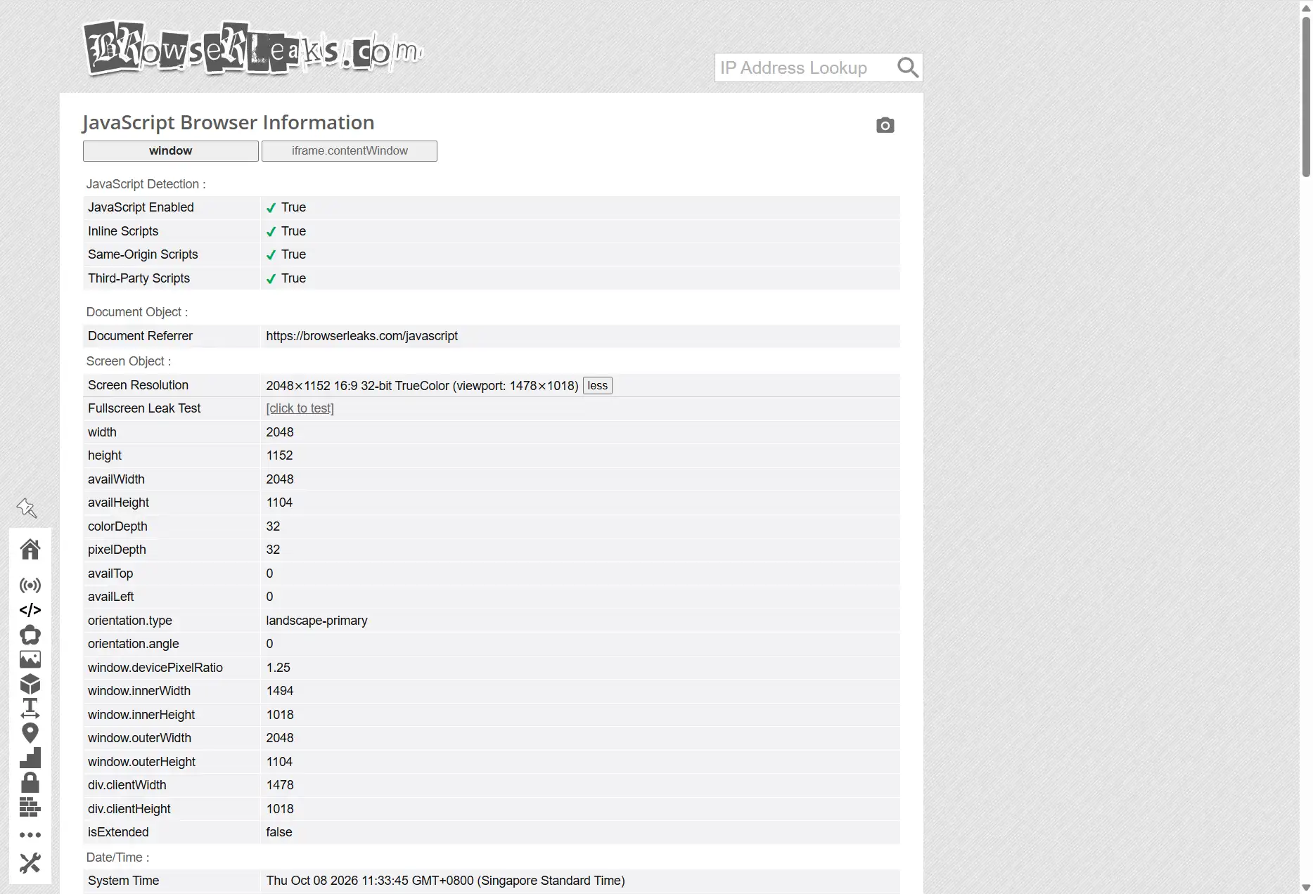
- Read the values in the console: press F12 to open the developer tools and enter screen.width, screen.height, window.innerWidth, window.innerHeight and window.devicePixelRatio in the Console; all five values come back in one go.
- Cross-check on a detection site: open the BrowserLeaks homepage and line up the Screen Resolution, Viewport Size, Device Pixel Ratio and Available Screen rows against one another. A detection page records the values at the instant it loads; with DevTools open the window rows shrink while the screen rows stay put, so simply keep that in mind when you compare.
- Run one change experiment: maximize the window and jot down one set of numbers, then shrink the window to half and jot down another. Screen-related parameters do not budge; window-related parameters follow along. Once the experiment is done, there is nothing left to memorize about which rows move.
For a more systematic way of reading detection reports, the guide to the Iphey trust score walks through the full method and works well alongside this check.
How to Set and Verify Screen Resolution in MostMate
Once the parameters and the pitfalls are clear, the last stop is the environment itself. MostMate keeps fingerprint configuration inside the environment form (环境表单), and the what-is-MostMate page covers what the product is about as a whole. This section sticks to the screen parameters.
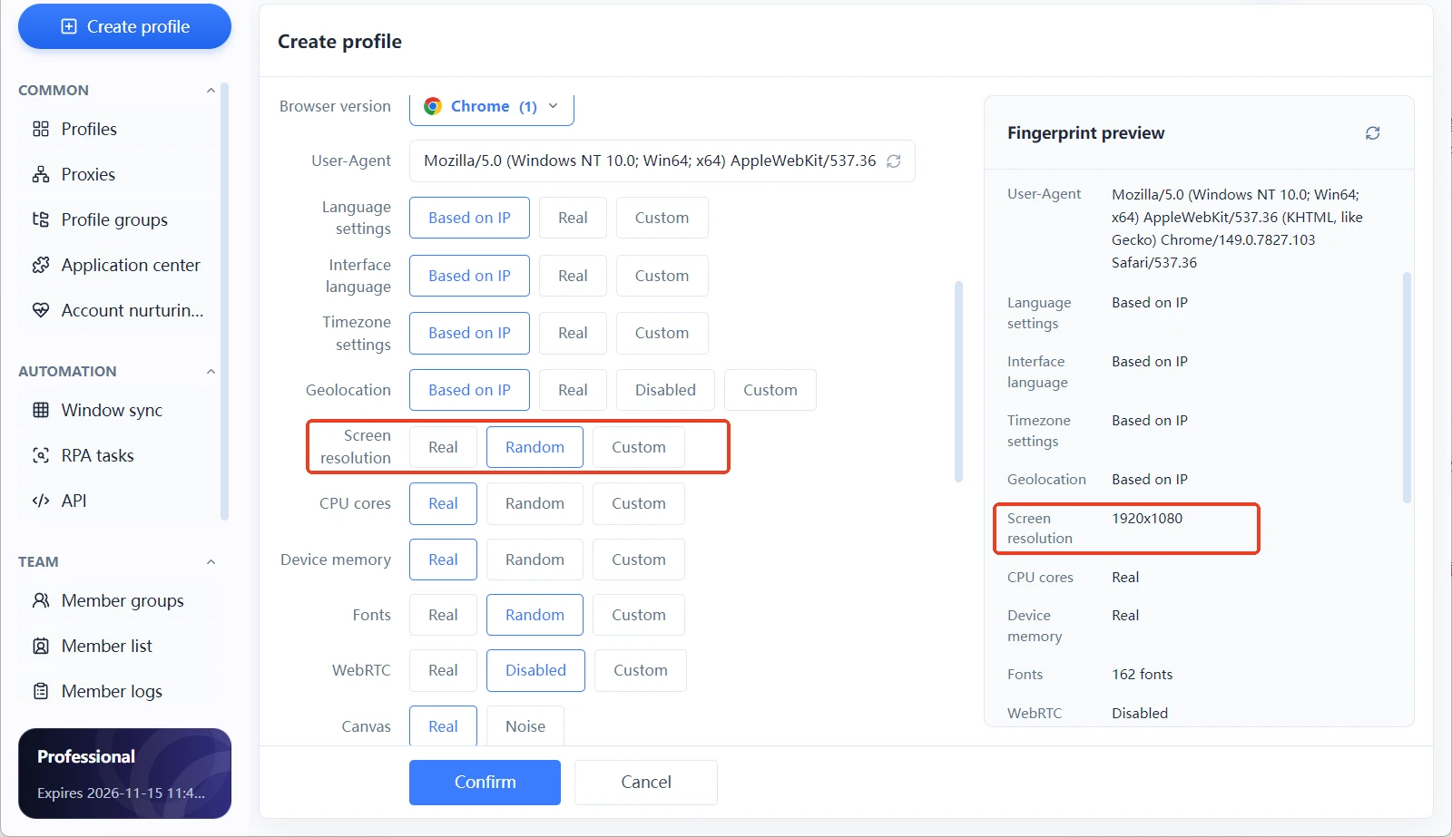
When you create or edit an environment, the fingerprint settings (指纹设置) hold the hardware parameters: screen resolution, device memory, CPU cores and the font list, among others. Screen resolution comes in three modes: Real, Random and Custom (真实、随机、自定义). The fingerprint preview panel (指纹预览面板) on the right lists the current values in real time, screen resolution getting a row of its own, so the result of every change is visible at once.
Real: takes the screen parameters of the local machine as they are. It suits the case of using the current computer as the one and only device, since the values match the real hardware. Most users running a single environment can stop right here.
Random: has the environment generate a random set of values. It fits the scenario of creating environments in batches without wanting every one of them to share the same screen profile. Randomness solves the "all identical" problem, not the "does it fit" problem; whatever the randomizer produces should still go past the preview panel and line up with the operating system and the browser version. Why random parameters can introduce new flaws of their own is the subject of the article on why fingerprint randomization is unsafe.
Custom: you set the values by hand. It suits building toward a target device profile, for instance entering a resolution typical of mainstream laptops and matching the DPR to the corresponding tier. Confirming all three parameters item by item on the same form spares you the rework later.
Verification after setup can run in three steps. First look at the preview panel and check that the screen resolution and the operating system fall within a plausible pairing. Next confirm that the DPR matches the resolution, treating rare combinations such as a high resolution with low scaling with caution. Finally, open the environment, visit a detection site once, and compare the values the page reports with those in the preview panel; when the two sides agree, the setup has truly landed.
Environments serving the same batch of business should either keep their screen parameters identical or spread them out along a discernible pattern. A half-random, half-real mixture is the state most likely to leave traces the moment accounts are compared.
Frequently Asked Questions
Are screen resolution and window size the same thing?
No. Screen resolution describes the pixel size of the display device; window size describes the visible area of the browser. The two describe different objects.
Does screen resolution on its own decide the browser fingerprint?
No. It is one group of supporting traits. A website judges it together with the operating system, the browser version, DPR, fonts, the GPU and the rest; resolution alone leads to no conclusion.
Does resizing the browser window change the browser fingerprint?
Your identity is not reset. A change in window size affects only the handful of window-related readings. Screen parameters and rendering traits stay untouched, and the website's overall picture remains essentially as it was.
Should the resolution in a fingerprint browser be set to random?
It is best not to boil it down to "the more random, the better". Randomization exists to keep several environments from sharing one set of parameters, and it works only as long as the random results pair sensibly with the operating system and the browser version.
On a 1920×1080 computer, is the browser window also 1920×1080?
Not necessarily. Window size depends on how you work: maximized, half screen, split view, each pulls the window size away from the screen resolution.
Closing Thoughts
The difference between screen resolution and window size comes down to the difference between "what this device is" and "how it is being used at this moment". The former is stable, the latter dynamic. Websites read two groups of values yet judge a single sheet. By this point, the puzzle of "mismatched numbers" in a detection report has found its explanation.
For everyday users, understanding these two groups dissolves most of the confusion a detection page causes. For multi-account operators, size parameters are the least expensive item in an environment self-check: run through the preview panel while configuring, then verify once against a detection site after going live.
MostMate gathers screen resolution alongside the operating system, DPR and the rest into a single environment form, so configuring doubles as verifying and every change takes effect at once. If that sounds useful, download MostMate, set up an environment, and read the preview panel against a detection page side by side.

MOSTMATE
Secure Multi-Account Management, Made Simple
Start with your first account and use MostMate to build safer, smarter, and more efficient multi-account operations.
- Independent profiles. Consistent identities.
- AI Automation · Account Health · Team Operations